Adhesives: Bringing Sexy Back
By Beth Miller

The new Taylor Adhesives catalog utilizes black and white imagery alongside a call-to-action designed to evoke an emotional response. “Inspire Your Environment” points to Taylor’s commitment to sustainability. Photo: Taylor.
Justin Timberlake is not the only one who is bringing sexy back. We asked readers in a recent poll: “Where would you like to see more advancements in flooring products?” Adhesives won by a landslide, signaling that there is room to grow, but in what direction? We put out the call to see just what adhesive manufacturers are doing to differentiate themselves. The overall arching theme is product visibility followed by performance and sustainability.
Achieving greater product visibility includes a whole host of changes. Manufacturers are diving deep into the packaging itself, looking at ways to make the labeling cleaner and the information clearer. They are working to bring the most important information to the forefront, including performance and sustainability related information, using concise text and icons. Colors are being put to work to assist in the identification process and even used to evoke emotion.
Bona: Installer First
Wayne Highlander, director of adhesive sales, Bona, has been an installer for over 30 years and uses his experience to assist in the product development process. He and the Bona team approach each product decision from the standpoint of the installer before considering the next step.
“The guy installing the flooring has to like working with the product; that’s number one,” said Highlander. “If that doesn’t happen, nothing else matters. Then, it goes to the performance of the product, and then, to the health and safety of the installer and the homeowners.”
With a focus on ease of use and efficiency, Bona recently launched its Quantum Flow silane-based wood-floor adhesive product that is highly pourable. Its focus is to cover more square footage in less time, saving installers time and energy. Additionally, Bona developed a standup trowel to help installers spend less time on their knees.
“I think one day we are going to look at guys on their hands and knees installing adhesives like we looked at the manual nailer,” said Highlander.
When it comes to performance, Highlander says that Bona works hard to preserve the performance characteristics of previous products in its new introductions. It took Bona five years to dial in its Quantum Flow product. Installer/contractor feedback, according to Highlander, has been all positive.
“With my experience as a contractor, we don’t like change,” said Highlander. “We want to use something that we know how it looks, how it feels, how it smells, and we know what to expect from it. So, we’re very aware of that.”
Bona’s adhesive products are not available for purchase through big box stores, which has been a differentiator for retailers. Another differentiator is sustainability.
Bona made the push toward Greenguard Gold certification about five years ago, according to Highlander. “That was an arduous process to get there,” he said. “It involves a lot of testing, and it’s expensive to do. With the pandemic, we knew this was going to really be something the consumer was interested in. We are in our homes longer than we ever have been before. You look at this beautiful 5/8” floor, and the kids are laying on the floor, the dogs are laying on the floor. Under only 5/8” floor is a sea of chemicals. When you think about it from that perspective, we impact that environment greatly. These homes are built faster than ever before. They’re closed up tighter than ever before. So, we look at it from that perspective of long-term use in the home. The indoor air-quality of the home is a big deal to us.”
Each Bona adhesive product (excluding the moisture barrier product) is labeled with the Greenguard certification. All Quantum products have zero VOCs and include Greenguard and VOC icons to make identification quick and easy. Bona is now adding the amount of post-consumer recycled material to its packaging.
Since Bona manufactures more than adhesives, its online catalog is comprehensive. The digital version of its product catalog is highly interactive, allowing users to search for a certain category of products or a specific product—all color coded. The adhesives category showcases a product image and description in a simple layout that makes locating the information needed easy. The catalog is a flipbook format, and the adhesives section utilizes green text and icons against a white background, making for a clean look. It also includes a page devoted to trowel selection based on moisture control.
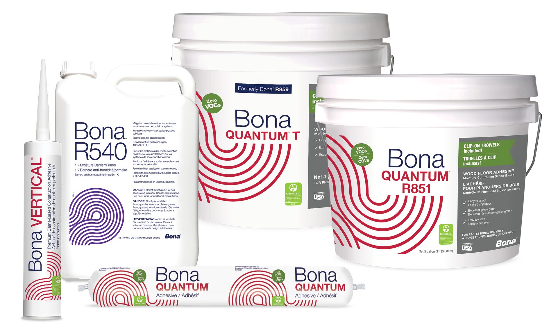
Bona’s Quantum products have zero VOCs and include Greenguard and VOC icons to make identification quick and easy. Photo: Bona.
Laticrete: Global Identity
This year Laticrete announced a number of product introductions and changes. Among them was the refresh of its packaging design “to reflect a unified, global identity,” said Jonathan Scott, senior product manager, Laticrete. “We want our Laticrete products to be instantly recognizable, no matter where in the world you are, or what language you speak.”
The new packaging uses less text and has added more intuitive images and icons, giving customers the most relevant information at a glance, according to Scott. These changes were the result of market surveys and simply spending time with contractors, distributors and architects, asking about their specific needs and how to make their work easier and more productive.
Additionally, Laticrete asked questions like: What are the evolving needs of our audience? How do they choose the ideal installation products for their projects? Ultimately, the goal is to enhance the products to make it easier for customers to select the right products for the right job.
Sustainability certainly plays a role in product selection. Many of Laticrete’s adhesive products are Greenguard Gold certified and are clearly marked with the Greenguard Gold icons to aid in quick identification. The firm also offers HPDs for the majority of its product offerings, including adhesives.
According to Scott, Laticrete has made changes to its website that includes an adhesive product family brochure and comparative matrix that lays out the full range of adhesives and their ideal applications.
“We continually strive for improvements and explore innovative solutions, aiming to enhance the performance of our adhesive products and most importantly support the productivity of our installers,” said Scott.
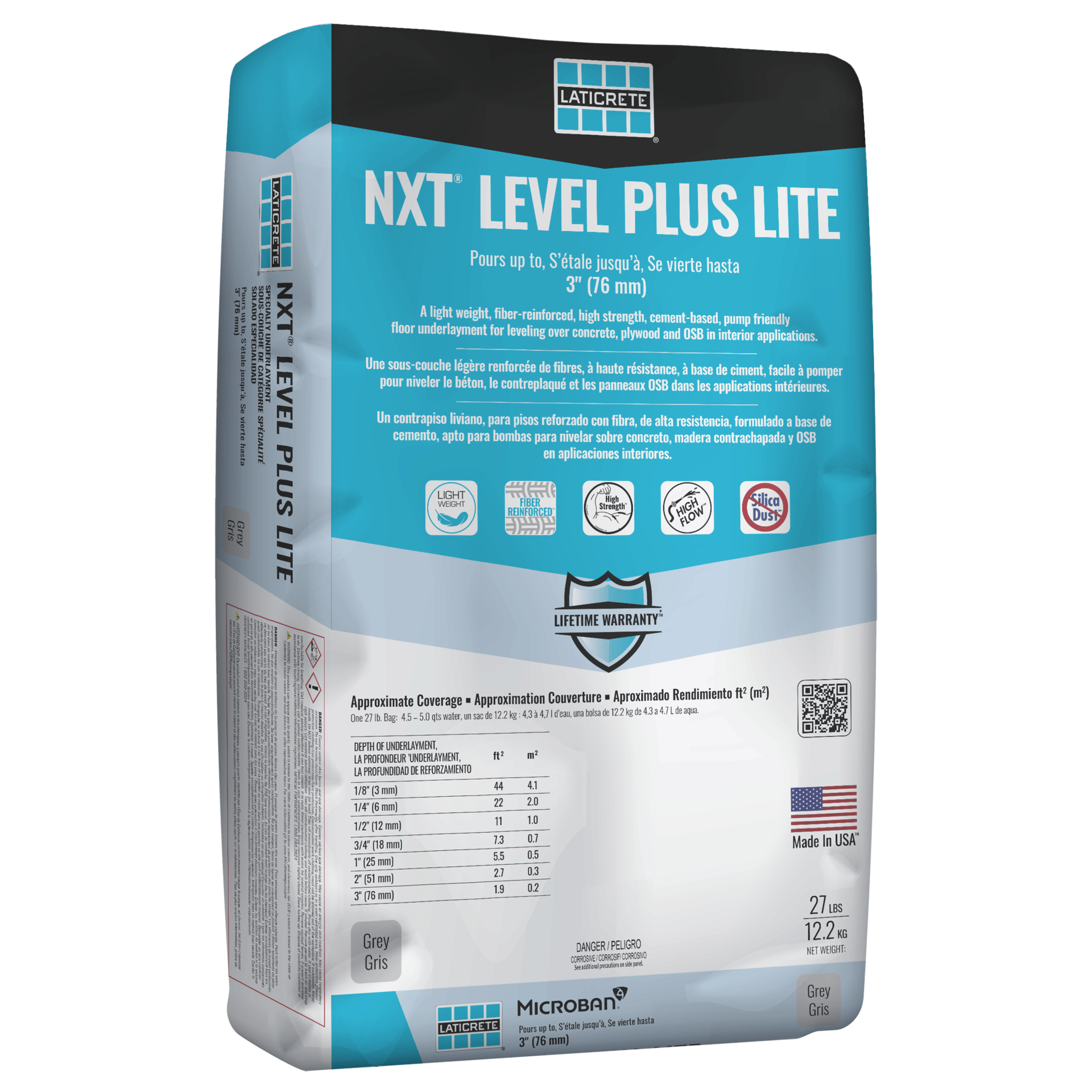
Laticrete’s new packaging uses less text and has added more intuitive images and icons, giving customers the most relevant information at a glance, and colors will be based on product type. Photo: Laticrete.
Schönox: Not Just a Subfloor Provider
Schönox, based in Germany, was founded over 125 years ago. Schönox HPS North America was developed to bring Schönox products to the North American market and has made a name for itself as a subfloor prep. industry leader. However, that is not the only thing it offers.
“We are an adhesive provider,” said Ryan Bassett, technical solutions manager, Schönox. “We often get left out of the conversation when it comes to adhesives because they’re going with what’s specified or what the floor covering manufacturer tells you. But over the last six to eight months, we’ve seen a trend where people are a little bit more interested in alternative adhesive options.”
According to Tracy Johnson, creative director, Schönox, Schönox HPS North America has been providing flooring adhesives to the U.S. market since it was founded in February 2011.
The firm recently relaunched its Emiclassic in a smaller pale to target residential projects and punch list items. This universal, LEED-certified adhesive hit the market in 2012 packaged in a 4-gallon pale that covers 380 to 850 square feet. The new 1 ¼ gallon pale covers 120 to 245 square feet.
“The industry is a lot different here than it is in Germany, but what we offer in the States is what we believe is our best adhesive and most fitting for most scenarios—Schönox Emiclassic,” said Bassett. “This is a true universal adhesive for flexible floor coverings, meaning LVT, carpet tile, broadloom, sheet goods, anything on a roll, anything flexible.”
Since Schönox focuses on building a solid system from the bottom up, it is not necessary for their adhesives to meet or exceed 99% RH. Emiclassic is rated for up to 95% RH.
“We want to do it right from the beginning,” said Bassett. “Our adhesives are not 99% RH; however, their quality ensures what they’re supposed to do which is bond the floor. As long as you are working with us through the system, we can provide people with a full system warranty.”
In addition to offering up a smaller option to hit a wider variety of needs, the idea of a universal glue is to eliminate the need for a different glue for each flooring type, points out Bassett. It reduces the cost associated with purchasing a large variety of adhesives to meet each need, ending up with a pallet of leftover product that can’t be used again.
To help spread the word about its universal adhesive product, Johnson said Schönox HPS is developing relationships with top surface manufacturers, general contractors, flooring contractors, architects and designers, and flooring installation companies to show how Schönox adhesives provide subfloor solutions on the same level as its patch, repair and smoothing compounds, primers, moisture mitigation systems, self-leveling compounds and underlayments, and waterproofing and crack isolation materials.
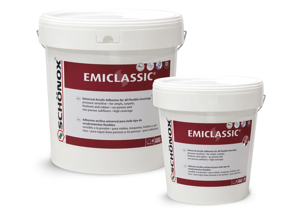
Schönox recently relaunched its Emiclassic in a smaller pale to target residential projects and punch list items. Photo: HPS Schönox.
Taylor: Changing the Conversation
For about a year now, Taylor Adhesives has been promoting its “More Than a Sundry” campaign to change how we view and talk about adhesives. As a company that focuses solely on adhesive products, Taylor has completely revamped its product catalog, website, product labels, messaging and has even added some new products.
“All the flooring companies have a very unique way of being able to talk about how they derive their colors, textures and patterns,” said Seth Gladden, director of marketing, Taylor. “They spend a lot of time marketing the sexier side of products. When you look down at a floor, you see the floor. The challenge for a flooring adhesive company is that no one ever sees our product. The installer does, but 99% of the time they are just going to grab an adhesive and they’re gonna put it on the floor and cover it up. No one thinks about the VOC content. No one thinks about whether it is solvent based or whether it has isocyanates. They don’t think about how it contributes to indoor environments. Out of sight, out of mind. My challenge was how do I make flooring adhesive sexy?”
According to Gladden, Taylor spent a lot of time looking at not only their own products but also their competitors and concluded that from a data standpoint, communication was lacking. He points to the technical data sheets, citing the difficulty in locating information such as RH, MVER, and traffic wait time. Further complicating things was the fact that the data was in completely different places on each data sheet. The first step was to pull everything together in a usable format.
“That’s when I introduced our data icons,” said Gladden. “That’s been a number one compliment from everyone in the space. At a glance, you can look at a label and you know immediately all of the main data points pertaining to that product.”
Phase two went beyond streamlining communication to “how do we change the conversation?” That’s when the “More Than a Sundry” campaign was introduced, posing the questions: How do we get people to stop and think about adhesives? Why does it matter? Why should I care about adhesive brand X compared to adhesive brand Y?
“Adhesives have historically been known as a sundry,” said Gladden. “You’ve got all kinds of sundries. Doorknobs are considered a sundry, but we consider ourselves to be a vital accessory. To our customers, we don’t want to be seen as something that is not important or doesn’t matter. If you look up ‘sundry’ in the dictionary, you get a short definition of things that don’t have much value. You look up ‘accessory’ and you get a definition of something that enhances your look or your performance and that’s what we feel we do.”
Taylor developed a comprehensive marketing strategy that spans the entirety of its product lineup. The website and product catalog (both online and print) are designed to reflect ease of use. In addition to the data icons mentioned above, the product labels and packaging reflect the new look as well—black pales, white labels, color-coded products (green=resilient, orange=wood, yellow=carpet, blue=moisture and aqua=specialty), making for quick identification.
To further differentiate Taylor’s products from competitors, room scenes were added to the buckets. The images are designed to help consumers visualize the type of product that can be installed with that specific product and evoke an emotional response that is key in the purchasing process, according to Gladden.
“You’re looking on the shelves and you see Competitor X who has 9807,” said Gladden. “Then, you see right next to it a really good looking pale with data icons and a really good-looking room scene showing what it could look like finished and it’s called Dynamic. I can remember that product Dynamic.”
While the products themselves, their makeup and their performance are important, Gladden points out that product chemistry is not what is influencing the buying decision in most cases. It goes beyond that.
“They want a partner,” said Gladden. “They want someone who is in it with them. They want someone that they can rely on, someone that they not only trust the technology, but they also trust the testing. They trust the marketing that it’s going to do what we say it will. Then, they want to see our follow-through.”

Taylor invites consumers to “Illuminate Your Image; Ignite Your Performance; and Imagine Our Partnership” through the use of its comprehensive adhesive lineup, its many easy-to-use online resources and the support it offers through its tech teams. Photos: Taylor.
